Visualizing Geospatial CSV Data with geoplot
When working on geodata, we needed a way to verify the output: are the H3 cells actually covering the right countries? Eyeballing raw CSV files with thousands of lat/lng rows is not practical. We needed to plot them on a map
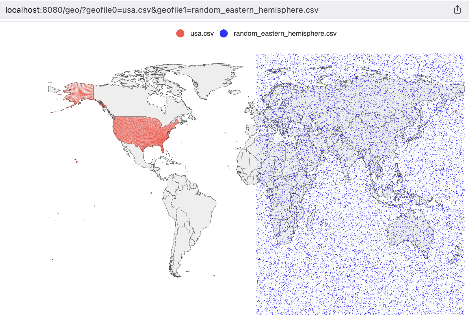
geoplot is a small Go HTTP server that reads CSV files and renders their coordinates as scatter points on an interactive world map. You pass it file names via query parameters, it serves back a rendered map in the browser
How It Works
The server exposes a single endpoint: /geo/. You specify up to 100 CSV files via query parameters geofile0, geofile1, and so on. Each file is loaded, parsed, and rendered as a separate series on the map with a distinct color
http://localhost:8080/geo/?geofile0=usa.csv&geofile1=latlon.csv
Column Auto-Detection
The CSV parser does not require a fixed column order. It scans the first data row and finds the first field that parses as a valid latitude (a float between -90 and 90). That column index is stored and reused for every subsequent row. The column immediately to its right is treated as longitude
This means it works with CSV files that have leading ID columns, like the output from geodata:
id,lat,lng
599690792927657983,52.765347,5.199402
The id field is not a valid latitude, so the parser skips it and correctly identifies lat as column 1
Rendering
The chart uses go-echarts, which wraps Apache ECharts. Each file becomes a named scatter series. Points are sorted by latitude before rendering, which does not change the visual output but makes the series consistent across reloads. The map is interactive: you can zoom and pan in the browser
Colors cycle through a fixed list (red, blue, black), assigned by file index. The file name is used as the series label, so it appears in the legend